Homepage Hero Copy That Converts for SaaS Products
Fix your hero's headline to speak to visitor outcomes, not product features.
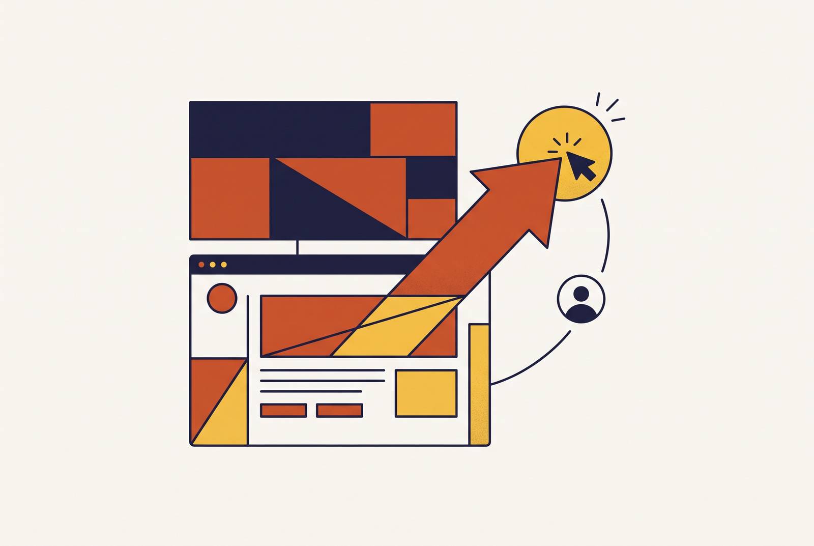
SaaS homepages tend to fail at the same three points. The hero talks about the company instead of the visitor's problem, the call-to-action sits three scrolls down, and the testimonials that could close the deal sit buried in the footer where nobody scrolls that far. Fixing those three things separates a homepage converting at 3.8%, the category median, from one converting well above that median. Roughly 9,100 SaaS companies compete in a market valued around $247 billion as of 2024. A homepage stopped being a branding exercise a while back. Most teams still write it like one.
How visitors actually read a hero section, and what that means for copy priorities
Nielsen Norman Group's research puts a hard number on how little time a page gets to prove itself: visitors often leave within 10 to 20 seconds, and a page has to communicate its value inside the first 10 just to earn a longer look. A headline about "AI-powered infrastructure" burns through most of that runway before it ever answers what the visitor actually came for.
The eyetracking data behind this is worth sitting with. Nielsen Norman Group analyzed 57,453 fixations and found that the 100 pixels just above the fold got 102% more attention than the 100 pixels just below it. Visitors spend about 57% of their total time on a page above the fold, per the same research. That's the single most valuable stretch of real estate on the entire site, and most teams fill it with a sentence about what their engineering team built instead of what the visitor gets out of it.
Chartbeat's data, drawn from 25 million user sessions, adds a wrinkle that trips up a lot of hero design: the most-viewed area of a page sits about 550 pixels down, not at the very top, because visitors start scrolling before the page even finishes loading. The hero has to work for someone already in motion, not someone reading calmly from the first pixel down.
None of this leaves room for a hero that spends its one guaranteed read explaining internal logic. Every word given to the product's architecture is a word taken from the visitor's outcome, and that trade almost never favors the architecture.
The discipline that separates converting headlines from informative ones
Research into B2B SaaS landing pages found outcome-driven headlines scoring an average of 14 points higher than feature-driven ones. Put two headlines side by side and the gap explains itself.
"AI-powered B2B data enrichment at scale" describes what got built. "Fill your CRM with verified contacts in 60 seconds" describes what the visitor walks away with. Only one of those makes a stranger keep scrolling, because only one answers the question the visitor actually brought to the page: what's in this for them, and how fast do they get it?
Established products bet on the second kind, and the safer bet is theirs. Notion's homepage reads "Write. Plan. Share." No feature named, no jargon, just the outcome. Stripe runs with "Financial Infrastructure to Grow Your Revenue," selling the result of using the product rather than describing the product's mechanics. Teams that keep writing headlines around architecture are optimizing for the wrong reader: the one who already understands the product, not the stranger deciding whether to keep scrolling.
A useful gut check before shipping any headline: read it to someone outside the company and ask what the product does. If they pause, or ask a follow-up question, the headline was written for the product team, not the buyer. That single test catches most of the vagueness that creeps into hero copy written by people who've spent months inside the codebase, and it costs nothing to run.
Vocabulary matters as much as structure. Headlines built from customer-sourced language, the actual words buyers use to describe their own problem, consistently beat copy written in marketer-speak. One company shifted from feature-focused messaging to problem-focused positioning and grew from 23 to 180 customers in three months. The only variable that moved was the words on the homepage.
A formula worth keeping on hand when drafting: "[Product] helps [specific audience] [achieve specific outcome] by [core mechanism], so they can [downstream benefit]." It's rigid on purpose. A headline trying to appeal to everyone usually ends up meaning nothing to anyone in particular.
What the subheadline and hero visual need to do once the headline lands
The subheadline exists to add what the headline left out. Its job is naming the specific role being spoken to and the specific problem being solved, one layer of precision the headline deliberately skipped to stay punchy.
The visual carries its own weight, and a static screenshot is the wrong default for it. A screenshot shows a single frozen state. A micro-animation or looping workflow illustration shows a transformation, and transformation is what persuades, because the visitor is trying to picture themselves using the product, not admiring a still image of its interface. Showing one core workflow clearly beats cramming in every feature at once.
Some homepages go further and embed an interactive demo directly in or just below the hero. That lets a visitor explore before ever talking to a salesperson, closer to a test drive than a fully gated "request a demo" form, and it qualifies intent in real time as a side effect. The smarter version gates only the follow-up, something like "talk to an expert about what you just saw," rather than gating the demo itself.
Flow Agency's 4C framework (Clarity, Comprehension, Credibility, Conversion) positions Clarity as the first and foundational phase. The visitor's only job above the fold is recognizing they've landed somewhere relevant to their problem. No testimonial, no pricing table, no clever line of copy further down the page rescues a hero that fails at that first job. Clarity outranks everything else this high on the page. It's the prerequisite for everything after it, not one feature among several.
CTA placement and copy, how specificity removes the friction of clicking
One CTA above the fold builds momentum. Two build hesitation, because now the visitor has to choose, and choosing is friction the page didn't need to introduce. The strongest homepages keep CTAs above the fold to a minimum, and repeat the same button after each feature section further down, so a visitor is never asked to pick between competing paths.
Specificity in the copy does real work here too. "Start your free 14-day trial" tells a visitor three things at once: the cost is free, the duration is 14 days, and here's the action expected of them. "Get a personalized demo" signals the experience won't be generic. "Learn more" tells the visitor nothing about what happens after the click, and vague CTAs like that create hesitation instead of removing it. Between the three, only the first two are worth shipping. "Learn more" belongs on a blog post, not a hero.
On one fintech SaaS project, moving the primary CTA from mid-page to above the fold, and swapping in more specific copy, produced a 28% jump in demo bookings, with no change to the product underneath. Placement and specificity aren't two separate levers there. They compound. Moving a vague CTA above the fold recovers some of the loss. Replacing vague copy with specific copy recovers more. Doing both at once is where the real lift shows up.
Heyflow states that the CTA is the actual purpose of the landing page, and every other piece of copy exists to walk the visitor toward that click.
Where social proof belongs in the hero, and why placement matters as much as content
Grafit Agency's research puts real numbers on this: customer testimonials can lift sales page performance by 34%, and social proof notifications, the small "X people signed up today" nudge, can boost conversions by as much as 98%. But only when a buyer actually sees them at the moment of hesitation, which is the part most teams get backwards.
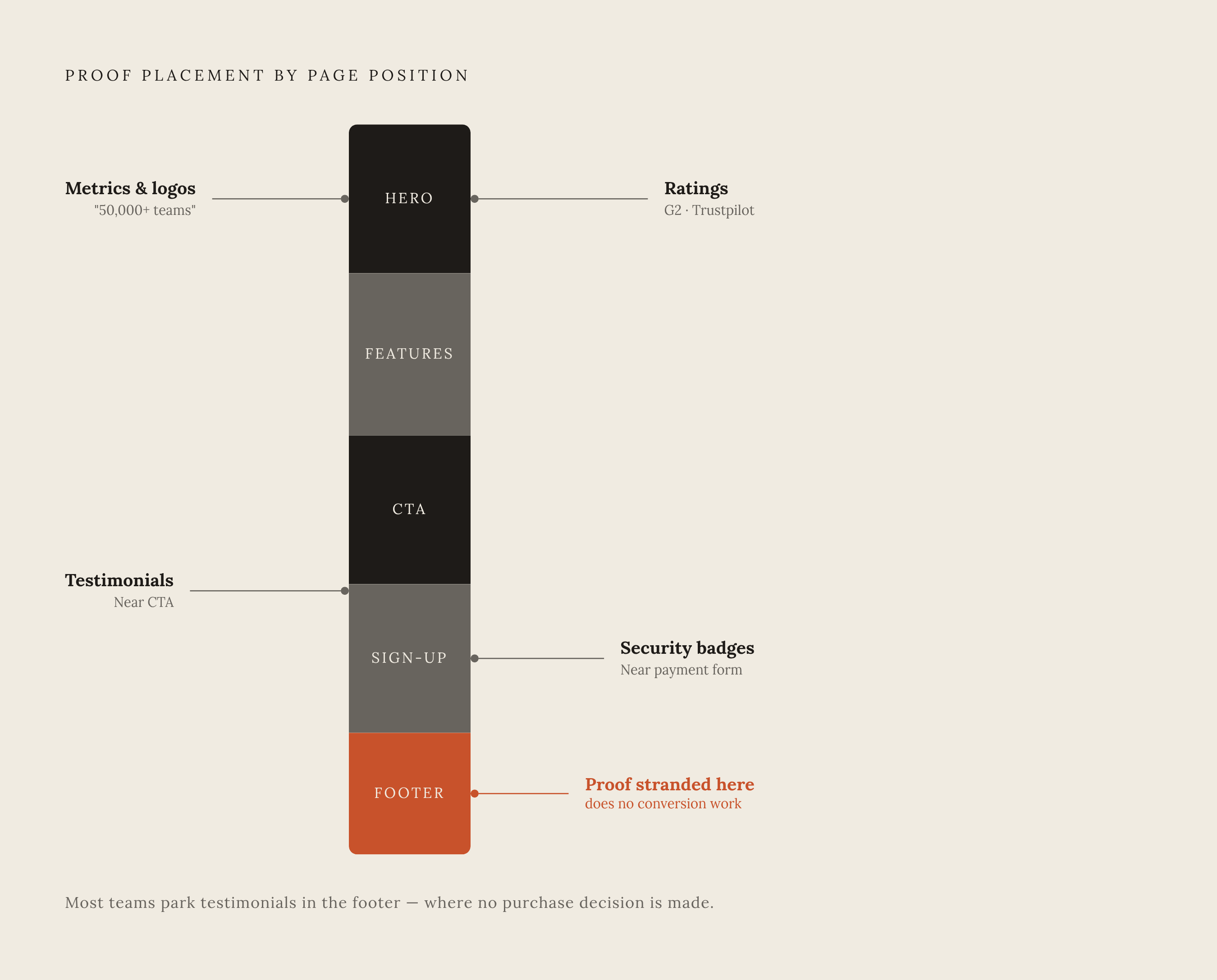
The recurring mistake is stranding generic testimonials in the footer. The buyer who needed that reassurance to keep scrolling never got that far, so the proof does nothing for anyone. Fixing this requires more than writing better testimonials. It's a matter of moving the ones already written to where the doubt actually happens.
Different types of proof belong in different spots, and treating them interchangeably wastes most of their value. Metrics like "used by 50,000+ teams," or a row of recognizable logos, work best in the hero and header, building credibility before the visitor has invested any real reading time. Customer testimonials work best near the CTA itself, where they neutralize the specific doubt a buyer feels right before committing. Security badges belong near payment forms or signup steps, where that concern actually arises. Third-party ratings, G2 or Trustpilot scores, work well alongside or just beneath the primary CTA.
Outcome-focused testimonials beat generic praise every time. "We cut onboarding time in half" answers a specific, nameable objection with a result someone can check. "Great product, highly recommend" answers nothing at all, and pages that lean on that kind of quote are usually filling space rather than reducing doubt. Slack's homepage, per Heyflow's breakdown, leans on video, names recognizable brands, and puts a human face on the people behind those brands. That combination, recognizable and human, converts better than a wall of anonymous logos.
The 5+1 messaging framework includes social proof as a required element, and its placement in or just beneath the hero is what turns it into a conversion asset instead of decoration sitting three scrolls too late.
The full page structure that reinforces what the hero started
Per Grafit Agency, the structure that shows up again and again on above-average-converting SaaS pages runs Hero, then Features, then Social Proof, then CTA. Each section has a distinct job, and skipping the order undercuts the whole sequence rather than just weakening one part of it.
The hero states the outcome and earns the scroll. Features then translate that outcome into specific moments inside the visitor's actual workday, framed as "how it works" rather than "what we built," so each capability connects to a task the visitor already recognizes instead of floating as an abstract list. Social proof comes next, proving the outcome is real through testimonials, case studies, and metrics, placed after comprehension has been built but before the final ask. FAQs and objection handling clear out whatever friction remains, and structured question-and-answer content tends to help with AI discoverability as a side benefit. The closing CTA restates the value once more and gives one final, singular action, with a link to further resources for anyone still unconvinced.
Companies applying the full 5+1 messaging framework (market context, specific problem, audience, why existing solutions fall short, the solution, and social proof) report a 317% increase in above-the-fold conversion rates. Below the fold is where supporting detail reinforces what's already been introduced, where the outcome the hero named gets more certain section by section, until the CTA feels like the obvious next step instead of a leap.
Testing and technical performance, the two levers that protect hero copy from invisible losses
Good copy dies quietly when nobody tests it and nobody checks load time. Both failures stay invisible until someone actually goes looking for them, which is exactly why most teams never find them.
The testing discipline is simple to describe and harder to actually stick to. Build two or three headline variants per outcome bucket. Change one variable at a time, headline, CTA copy, or hero image, never several at once, because testing multiple variables together makes it impossible to know which change moved the number. Before any variant ships, run it past someone outside the company. If they can't explain what the product does in a single sentence, the headline isn't ready.
Copy performance also depends on something copywriters rarely control directly: page speed. Google's Core Web Vitals set the baseline. Largest Contentful Paint, how fast the main hero image or headline actually renders, needs to land under 2.5 seconds. Interaction to Next Paint should stay under 200 milliseconds. Cumulative Layout Shift should stay below 0.1. Google's own research found that once LCP crosses 2.5 seconds, bounce probability jumps by 32%, and at 4 seconds it exceeds 90%. A hero written with real discipline, tested and refined, still converts no better than an untested one if it takes four seconds to paint. The bottleneck there was the design. It was the rendering.
Email traffic converts at 16.9%, which makes it a strong channel for running hero copy variants before rolling a winner out to paid traffic. A well-crafted outcome-first hero that loads slowly, or whose CTA copy has never been tested against an alternative, remains unfinished work. It's a hypothesis nobody has checked yet.
How AI discovery is changing which hero copy gets seen in the first place
Search behavior has shifted underneath all of this, and treating it as a future trend rather than a current fact is the mistake to avoid. ChatGPT alone handles over 1 billion prompts a day, has passed 400 million weekly active users, and draws more than 5.2 billion monthly visits. A meaningful share of buyer research now happens somewhere other than a search engine, before a visitor ever lands on a homepage at all.
Capgemini found 58% of users have already swapped classic search engines for AI tools when researching products or services. Zero-click searches have risen sharply alongside the rollout of AI Overviews, reducing the share of queries that ever reach a homepage. Referral traffic from AI chatbots grew 357% year over year, hitting 1.1 billion referral visits by June 2025, per Similarweb's 2025 Generative AI report. That's present demand, not a hypothetical to plan around later.
Two newer disciplines answer to this shift: Generative Engine Optimization (GEO) and Answer Engine Optimization (AEO). Traditional SEO chases a ranking position on a search results page. GEO instead optimizes content so a large language model cites it as a trustworthy source when answering a question. The overlap with hero copy is direct: the same outcome-first, specific, evidence-backed language that converts a human visitor is the language these models tend to pull from and cite. Vague, feature-heavy copy doesn't just underperform on a homepage. It goes effectively invisible to a language model too.
Research published at KDD 2024 found content backed by verifiable statistics and named citations achieved 30–40% higher visibility in answers generated by AI models than unoptimized content got. The GEO market itself is projected to reach $365.4 million in 2026, a number that says most SaaS marketing teams haven't caught up to this shift yet. A hero built around a clear outcome and backed with specific, checkable evidence does double duty: it serves the visitor who lands on the page, and it builds the kind of content that gets cited in the AI answers deciding whether that visitor finds the brand at all.
What agencies managing SaaS clients need beyond the copy framework itself
Agencies running this kind of work across a portfolio of SaaS clients face the same problem multiplied. Every brand needs outcome-first messaging, tested against real alternatives, with its visibility in generated answers tracked over time rather than checked once at launch. And the account team sitting across from that client needs a way to report on all of it credibly.
Knowing the framework, outcome-first headlines, specific CTAs, correctly placed social proof, isn't the hard part anymore. The hard part is proving, with numbers a client can check, that the rewritten hero actually moved conversion, that the new CTA copy actually beat the old one in a real test, and that the brand actually shows up when a buyer asks an AI tool for a recommendation instead of typing a search query. That's a measurement gap as much as a copywriting one, and most agencies are still building the reporting to close it.
Sources
- Powerful & Easy-to-Use CRM for Small Businesses | Nutshell
- SaaS Website Best Practices for Higher Conversions in 2026
- Maximize conversions with these SaaS landing page best practices | Heyflow
- High-Performing B2B SaaS Landing Page: Best Practices
- Conversion rate optimization best practices for SaaS in 2026
- lovable.dev
- alfdesigngroup.com
- aisearch.similarweb.com