Essay Visual Identity
Brand Color Palette Selection for SaaS Products
Color choice determines whether SaaS buyers notice your product or ignore it.
A brand's color palette is a positioning decision. It signals category, seriousness, and price point before a visitor reads a single line of copy, and in SaaS, where feature sets converge fast and AI tools push visual output toward sameness, color is one of the last variables a company fully controls.
Skipping the palette decision, or delegating it to whoever happens to be free that sprint, usually produces a product that looks like everyone else's. When every competitor's homepage uses the same blue-on-white template, buyers stop noticing calls to action and start comparing line-item features and price, because there's nothing else left to distinguish one product from the next. That's the commodity trap, and color is one of the few remaining levers that pulls a product out of it. Color affects brand recognition significantly, by some estimates as much as 80%, and figures from Colorcom and the CCICOLOR Institute put the share of consumers who say color is the main reason they pick one product over a competing one at roughly 85%. Those same sources put the bulk of snap judgments, somewhere between 62% and 90% of them, as happening within about 90 seconds and based on color alone. None of that is a marketing footnote. It's revenue, decided before anyone reads the pricing page.
The cost of the blue monoculture for SaaS brands
Counting the blue logos across any SaaS product directory reveals how dominant the color has become. More than 70% of SaaS brands use blue as their primary color. Blue has quietly stopped functioning as a differentiator and started functioning as a category badge. It says "software company" the way a green cross says "pharmacy." That's not much, though it's not nothing either.
A 2026 Interbrand audit found blue still holding 41% share among tech brands, but with a telling wrinkle: 23% of those brands had added coral, amber, or lime green accents within an 18-month window specifically to break from the pack. That's a market correcting itself in real time, brand by brand, because staying purely blue was starting to cost more than it earned.
None of this makes blue a bad choice. Blue carries real associations with trust, security, and stability. That's exactly why fintech, B2B SaaS, and enterprise tools reach for it so often. The failure isn't the hue itself; it's using blue with no distinct hierarchy and no memorable accent, so the page reads as generic rather than reliable. When a landing page is visually indistinguishable from three competitors', prospects stop processing it as a brand and start processing it as a category placeholder.
Try the squint test. The squint test involves putting a landing page next to three direct competitors', blurring your eyes until the copy disappears, and seeing what's left. If the brand vanishes into the row of blue rectangles, the fix is deeper than sharper UI polish. It's a memory problem, and no amount of pixel-level refinement solves it.
What the research shows about color and buyer behavior
Consistency is where color turns from a design choice into a compounding asset. According to the Nielsen Visual Identity Report, brands holding strict color consistency across seven or more touchpoints, digital and physical combined, saw brand recognition climb by as much as 87%, with consumer recall times dropping by an average of 1.3 seconds compared to brands with inconsistent color use. That's a substantive gap of 87% and 1.3 seconds, not a rounding error. That's the difference between a buyer remembering a product on sight and a buyer needing a search engine lookup to recall the name.
Names fade faster than color does. Recall of a brand's actual name can drop off sharply after long gaps with no exposure, while the color identity tends to stick around in a way words don't. The practical read: color is the durable asset in brand memory, and copy is the perishable one. Treat the palette like a long-term holding.
A separate study out of the Visual Identity Lab, published in the Journal of Brand Management, tracked 500 direct-to-consumer brands over 18 months and found that brands holding one consistent signature color across paid media, organic content, and packaging scored substantially higher on brand recognition than multi-color competitors. Beauty and wellness brands saw an even sharper lift, several times higher. Marketing leaders feel this in the revenue line too: 35% report revenue growth of 10% to 20% they attribute directly to brand consistency, and another 33% report gains north of 20%.
This isn't just about being remembered, either. Adobe's research found 46% of consumers say a brand's color scheme matters when they're actually deciding to buy, and 33% say they stay more loyal to brands that keep their colors consistent everywhere they show up. Flip that around: 18% say they feel disconnected when a color scheme changes without warning. Color, in other words, touches acquisition and retention both. It's not a top-of-funnel decoration.
Counting the blue logos across any SaaS product directory reveals how dominant the color has become.
How color drives conversion at the page and campaign level
CTA color gets tested more than almost any other design element in SaaS, and it's also the most misunderstood. The instinct is to hunt for a universally "best" button color, usually red, on the theory that red converts because it signals urgency. That instinct is only half right, and treating it as gospel leads teams astray.
The better-supported principle is contrast. A CTA button works because it stands out against everything around it and because its color carries the right emotional weight for the moment, whether that's urgency, safety, or plain visibility. A red button on a page dominated by warm oranges disappears. The same red button on a cool, muted palette pops immediately. Context decides the outcome far more than the specific color on the swatch.
Saturation matters at the campaign level too. Meta's 2026 study of 640,000 ad creatives found that high-saturation color ads produced 47% higher click-through rates and 39% lower cost-per-acquisition compared to low-color, muted equivalents. For paid campaigns running at volume, that's not a marginal edge, that's a meaningfully cheaper funnel.
One rule holds regardless of hue: never let a CTA compete with another equally bold color on the same page. If the eye has two equally loud options fighting for attention, it hesitates, and hesitation on a pricing page or signup form is exactly what a conversion-focused layout is built to avoid.
The color categories gaining ground in SaaS
Palette trends in SaaS aren't arbitrary aesthetic cycles. Each one maps to a category and the emotional signal that category needs to own, and reading them that way is more useful than treating them as a mood board of pretty combinations.
The High-End Academic direction, built around warm oatmeal (#F3EDE2), a textured gray (#D8D1C7), and deep charcoal (#2B2B2B), suits enterprise SaaS, research tools, and deep-tech platforms. It reads like crafted paper stock rather than a glossy app screen, which signals seriousness without going cold.
Radioactive Earth pairs forest green (#1F4D3A) with electric lime (#C7F000) and neon peach (#FF8A5B). It fits green-tech, fintech, and AI infrastructure companies that want to signal organic trust and technical force at the same time. The tension between earthy and electric tones is deliberate.
Safety Orange leans on pure black (#111111), crisp white (#FFFFFF), international orange (#FF4F00), and cyber yellow (#FFD400). It suits dev tools, cybersecurity, and logistics SaaS, categories that need to project operational authority and calm under pressure rather than warmth. This palette doesn't ask for attention. It behaves as though it already has it.
Digital Twilight, built from deep indigo (#2C2A72), soft violet (#8C7AE6), and liquid silver (#D9DCE3), is the direction most associated with AI products, agentic platforms, and modern product-led SaaS. It reads as fluid and intelligent, familiar enough that enterprise buyers don't flinch, but distinct enough to avoid the default-blue trap. A related direction from BizNameLab, aimed at AI and deep-tech brands, swaps in deep indigo (#2E1A47), electric violet (#7B2FF7), neon cyan (#00E5FF), dark charcoal black (#0D0D14), and cool fog (#E6E6F0), a set built to signal machine intelligence rather than approachability or warmth.
Beyond individual palettes, some bigger shifts stand out. Dark mode-first design now appears in about 30% of new web design projects, up from just 8% in 2021 per Awwwards, which makes it a mainstream specification for developer tools, data platforms, and security software rather than a niche preference. Pantone's 2026 Color of the Year, Cloud Dancer (PANTONE 11-4201), a warm, very pale neutral, points to a broader move away from stark corporate white toward warmer, more organic neutrals. And mesh gradients, those multi-point, non-linear color blends, have become a signature look for AI-adjacent marketing pages in 2025 and 2026. They belong on marketing surfaces like hero sections and pricing pages. Inside the actual product UI, they tend to wreck contrast reliability, which makes them a liability rather than a flourish.
Building the palette as a system, not a mood board
A palette is a set of roles, and every color needs exactly one job. It's a set of roles, and every color needs exactly one job. The moment two colors compete for the same job, hierarchy collapses and the interface starts working against itself.
Five roles cover almost every SaaS product. The primary color carries brand identity: logo, dominant UI elements, the color that should still be recognizable even reduced to a black-and-white silhouette. The secondary color supports without competing, showing up in backgrounds, secondary buttons, and illustration work. The accent color is reserved almost exclusively for CTAs and links, anything the eye absolutely must find, and it should never share that job with another bold color on the same screen. The neutral base, grays, off-whites, near-blacks, carries the large majority of most interfaces that hold text, cards, and whitespace without demanding attention. And semantic colors, colors indicating success, error, and warning need to stay fixed and separate from branding colors, or users start misreading system feedback as a design choice instead of a signal.
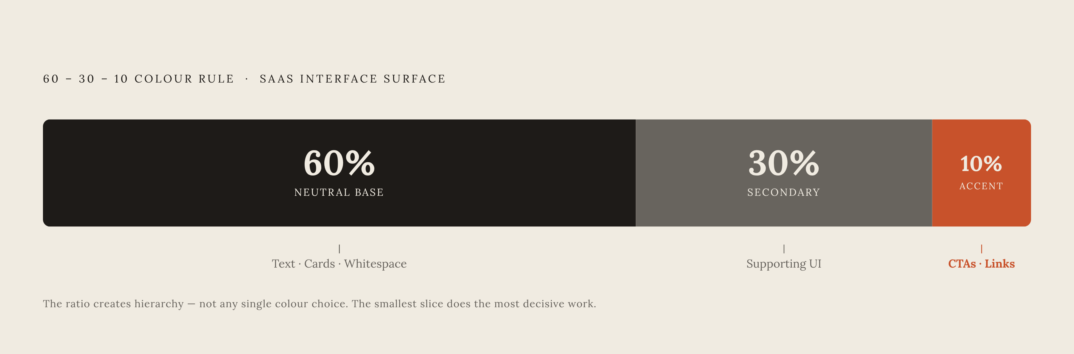
The 60-30-10 rule gives that system its shape: roughly 60% of the visual surface in the dominant neutral, 30% in the secondary or supporting color, and 10% in the accent. The ratio, not any single color choice, is what creates visual hierarchy.
Before adding a single hue, build the layout in grayscale. A page that doesn't read clearly without color has a structural problem, and adding color will just cover it up until it surfaces again the moment someone changes the theme. Color should sharpen an interface that already works. It shouldn't be asked to carry one that doesn't.
Accessibility as a palette constraint, not an afterthought
At least 2.2 billion people worldwide live with a vision impairment of some kind, near or distant, and roughly 300 million have some form of color vision deficiency. That's a population of 2.2 billion people, not a marginal user segment tucked into an edge case. It's a market large enough that ignoring it is a business decision with a cost attached, whether or not anyone frames it that way internally.
A large share of websites fail basic contrast checks. The large majority of SaaS products in production today are actively unreadable for a meaningful share of the people who land on them. That's a conversion problem baked into the design system itself, not a compliance footnote for the legal team to handle later. It's a conversion problem hiding inside the design system.
WCAG AA and AAA give concrete, testable targets, one set of contrast ratios for normal body text and a stricter set for large text and headlines, and hitting them isn't optional if the goal is a product usable by the full addressable market rather than the subset with typical vision. Certain combinations occur repeatedly in failed audits: light gray text on white backgrounds, medium-saturation blue on black, green text on red (or the reverse) for anyone with red-green color blindness, and low-contrast pastel button text against pastel button backgrounds. Each one looks fine to someone with typical color vision and fails immediately for a meaningful slice of everyone else. Building the palette with contrast ratios checked from the start costs far less than retrofitting an entire design system after launch, and it means the "premium, differentiated" palette a team worked hard to build actually reaches the people it was designed to reach.
Notes
- UI/UX Design Agency in Bangalore | Tentackles
Provided the statistic that more than 70% of SaaS brands use blue as their primary color.
- 15 High-Converting SaaS Color Palettes for 2026 (Hex Codes)
Provided the specific hex codes for the AI and deep-tech brand palette including deep indigo, electric violet, neon cyan, dark charcoal black, and cool fog.
- 8 Best Color Palette Generators for SaaS Branding in 2026
Provided the figure that 33% of marketing leaders report revenue gains above 20% attributed to brand color consistency.
- https://www.amraandelma.com/color-psychology-in-branding-statistics/
Provided the core color psychology statistics including the 80% brand recognition figure, 85% product selection figure, 62–90% snap judgment figure, 87% recognition lift from consistency, and Adobe's 46% purchase-decision figure.