DIY Brand Style Guide for Early-Stage Startups
Four weeks to build the brand consistency that prevents costly confusion later.
A brand style guide costs nothing but time, and the startups that skip it aren't saving money. They're just deferring the cost to a moment when it's harder to fix: an early fundraising pitch, a first hire, a press mention that spells the company name three different ways. What follows is the minimum system a founder needs, built in four weeks, with no design background required.
What a minimum viable brand kit contains
A style guide at this stage is not a museum brand book. Nobody needs sixty pages on the emotional resonance of a color story before shipping an MVP. What a startup needs is the smallest set of documented decisions that creates consistency fast, across whatever channels the company already touches.
Founders tend to conflate four things that are actually distinct. Brand strategy is the positioning, the audience, the promise, the market angle. Brand voice is how the company sounds, in writing and in speech. Visual identity is how it looks. Brand assets are the actual files: the logo exports, the templates, the deck cover. A minimum viable kit needs pieces of all four, but it doesn't need much of any of them.
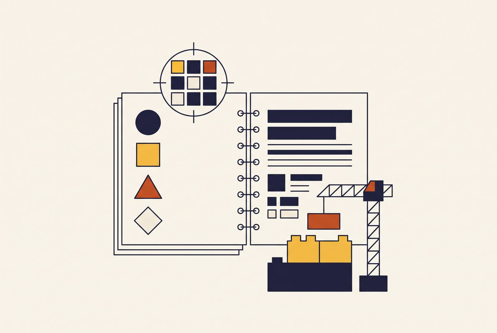
Five components make up the core: a logo with usage rules, a color palette, a typography pair, voice and tone guidelines, and a short list of do's and don'ts. That's it. It can live in a Notion page or a Google Doc, with sections for brand foundation, visual specs, voice examples, and usage rules. The highest-leverage assets to build first are the ones with the most eyeballs: the website hero section, a founder headshot, a LinkedIn banner, a pitch deck cover, and three or four reusable social templates.
A fully built brand book, secondary logo lockups, an icon library, all of that belongs to a later phase, once there's product-market fit and a team large enough to need that level of granularity. At the MVP stage, the goal is coherence. Document it in a one-pager and move on to the next thing.
Logo: the decisions that determine whether it scales
The only test that matters early on: does the logo hold up at 16x16 pixels, the size of a browser favicon? App icons need to scale up to large display sizes, and social avatars compress down significantly, so the mark has to survive the full range, not just look good on a splash screen at full resolution.
Bold geometric shapes work. Thoughtful negative space works. A distinctive, limited color combination works. Intricate illustration does not, and neither does a wordmark that turns to mush the moment it shrinks. A useful gut check: does the logo still work in plain black and white? If it only reads correctly in color, it's already a fragile system, because color reproduction is the first thing that breaks across different screens, print vendors, and platforms.
DIY logo tools have become the default entry point for bootstrapped founders: platforms like LOGO.com reported over 163,000 logos created in a single quarter in early 2026. DIY logo tools have become the default entry point for bootstrapped founders, making this the norm rather than a niche behavior.
Four paths exist: an AI logo maker, a freelancer marketplace like Fiverr, a boutique design studio, or a fully self-built mark using free tools. Each comes with a cost and quality tradeoff, and the founder should choose one on purpose rather than drift into it. A budget Fiverr logo gets you a file. It does not get you a system: no usage rules, no variants, no guidance on backgrounds or minimum size. That gap causes the inconsistency this whole exercise is meant to prevent.
So whatever the source, write down the decisions after the fact. Approved export formats (SVG for the web, PNG for everything else), approved backgrounds, minimum display size. Even a logo built in twenty minutes on a free tool needs a one-paragraph usage rule attached to it.
Color palette and typography: the decisions that create consistency without a designer
Three to five colors, maximum. One primary brand color, one neutral, one accent, and optionally a dark and a light background tone. That's the entire palette a startup needs at this stage, and adding more just creates more ways for it to drift.
Document each color three ways: HEX for the web, RGB for screens, CMYK for anything that gets printed. Give each one an internal name too, "midnight" or "slate" reads faster than a six-character hex code when someone's building a slide at 11pm before a demo.
Contrast is not optional. A palette that fails basic readability checks creates friction inside the product itself, and it becomes legal exposure as the company grows and accessibility compliance stops being optional. Checking it once, early, means the problem never resurfaces.
Typography works the same way: one font for headlines, one for body, not five fonts because five people each picked their favorite. Google Fonts covers nearly every startup's needs at zero cost. Document the weights in use, the sizes at each hierarchy level (H1, H2, body, caption), and a default line height so nobody eyeballs it differently on every new page.
The compound effect here is easy to underrate. One font pair and four or five colors, applied the same way across the website, the deck, and every social post, does more for perceived credibility than a visually elaborate but internally inconsistent setup that cost far more to produce. Consistency is the expensive-looking part, not the palette itself.
One more decision belongs here even though it's not a color or a font: photography style. A single clear direction, real people, natural light, no stock-photo handshakes, prevents the kind of visual incoherence that undoes a locked logo and palette the moment someone drops in a generic stock image.
Positioning statement and brand voice: the verbal decisions that prevent copycat messaging
Without documented voice guidelines, every person on the team, and every AI writing tool they lean on, makes an independent tone decision. The result is a company that sounds like five different companies depending on which channel you're reading.
A workable positioning statement follows a fixed template: for [target audience], who struggle with [problem], our product is a [category] that provides [key benefit]; unlike [competitor], we [differentiator]. The structure forces category clarity, which prevents the vague, adjective-heavy mission statement so many founders default to. A startup entering an existing category needs the differentiator clause to carry more weight. One creating a new category needs the narrative around it to carry more weight. The template handles both, the emphasis just shifts.
Voice guidelines work better as axes than as adjective lists. "Direct but not blunt" gives a writer a decision rule at the edge case. "Friendly and professional" does not, because almost every sentence can claim to be both. Two or three axes are enough: something about directness, something about expertise without jargon, maybe something about warmth.
Then show, don't just describe. Document how the voice sounds in an actual website headline, an actual error message, an actual LinkedIn post, an actual line from a pitch deck. Four real examples teach a new hire more in five minutes than a paragraph of abstract description ever will.
Borrowing the voice of a brand you admire, Stripe's clarity, Notion's playfulness, without running it through the filter of your own audience and category is a trap. What gets copied is the surface aesthetic. What gets lost is the reason that voice worked for that company. And on mission statements specifically: keep it simple, specific, and action-oriented. A mission that can't be repeated from memory by someone who heard it once fails to function as a brand anchor. Without that filter, the borrowed voice becomes decoration.
Usage rules: the section founders skip that causes the most damage
A logo, a palette, and a font pair without usage rules are just files sitting in a folder. Every person who touches them fills the gap with personal judgment, and judgment diverges fast across even a small team.
At minimum, usage rules need to cover five things. Logo rules: approved color variants, approved backgrounds, minimum size, clear space, and an explicit list of what never happens (no stretching, no recoloring, no drop shadows or bevels). Color rules: which colors are for backgrounds only, which are reserved for calls to action, and which combinations never get paired. Typography rules: which weight is for headlines versus body copy, and which fallback font is acceptable if the primary one fails to load (Arial, generally fine; Comic Sans, never). Imagery rules: the photo direction, plus specific examples of what to avoid, since abstract description doesn't stick the way a real example does. Voice rules: one or two side-by-side rewrites, the wrong version and the right version of the same sentence, so the tone difference is visible rather than described.
Usage rules head off three specific failure patterns. Founders rebrand too often because the original guidelines were too loose to enforce, so drift accumulates until a full reset feels easier than a correction. Founders design for their own taste instead of buyer perception, because there's no written standard to check personal preference against. And the visual identity fragments across channels because no single document functions as the source of truth, so the website looks like one company and the pitch deck looks like another.
File architecture deserves a line too. Set naming conventions and folder structure early, something as plain as brand_assets/, web/, social/, so the system scales cleanly once a second or third person starts touching the files. Revisit tool costs and folder logic on a quarterly basis, before the mess compounds. And whenever a choice feels ambiguous, a single question resolves most of them: does this serve buyer perception, or does it serve the founder's personal preference? Usage rules exist so that question doesn't get relitigated every single time it comes up.
Building the guide in four weeks without a design background
Week one is audit and direction. Collect every visual and verbal asset currently in circulation: the website, the deck, social profiles, the email signature. Count the inconsistencies honestly, how many fonts are actually in use, how many slightly different color values, how many versions of the "about us" paragraph exist across different pages. Then pick one direction. Trying to satisfy every stakeholder's opinion before starting is how this stalls out before week two even begins.
Week two is visual decisions. Lock the logo, either by finalizing something built with an AI tool or a freelancer against the scaling criteria covered above. Define the three-to-five color palette with hex codes and internal names attached. Pick a font pair from Google Fonts and write down the sizes and weights for each hierarchy level. Draft one sentence describing the photo direction.
Week three is verbal decisions and usage rules. Write the positioning statement using the template. Define voice on two or three axes with example sentences attached to each. Write the do's and don'ts for every visual element covered in week two. All of it goes into a single Notion page or Google Doc, no design software needed for the document itself.
Week four is building and testing templates. Produce three to five reusable assets: website hero, LinkedIn banner, social post, pitch deck cover, email signature. Test them across the highest-visibility surfaces, the website, LinkedIn, the deck. Then send them to one or two people outside the company, not for approval, but for first-impression data. What they notice in the first three seconds tells you more than what they say when asked directly.
A handful of free-tier tools cover the whole process: Canva for templates, Figma's free tier for design files, Coolors for palette generation, Google Fonts for typography, and a Notion or Google Doc for the guide itself. None of it requires a paid seat to validate whether the system works.
The business case for spending four weeks on this rather than skipping it: research cited by Lucidpress links consistent branding to a revenue lift as high as 33%. Four weeks is a small trade against that.
Brand consistency in the style guide and its effect on AI search visibility
Search behavior has shifted, and the numbers describe a real migration, not a trend piece. EMARKETER projections indicate that close to a third of the US population is expected to use generative AI search by 2026. OpenAI reports that ChatGPT crossed 900 million weekly active users as of February 2026. Google reports that AI Overviews have surpassed 2.5 billion monthly active users, with AI Mode past 1 billion monthly users on its own. Buyers are increasingly asking an AI system for a recommendation instead of scrolling ten blue links, and that changes what "getting found" actually means.
Research from omnibound.ai found that brand mentions correlate with AI visibility at 0.664, compared to 0.218 for backlinks, so a mention is roughly three times more predictive of whether an AI system cites a brand than a traditional link is. That reorders the priority list for a startup with limited marketing hours.
Here's where the style guide becomes load-bearing rather than cosmetic. If a company's name, its category descriptor, and its differentiator language show up worded differently across the website, LinkedIn, a press mention, its G2 profile, and a Reddit thread, because no one locked the language down, AI systems run into what amounts to entity confusion. The system can't confidently resolve that all five references point to the same company, and citation rates suffer as a result.
The fix belongs directly in the style guide: a locked entity language block. The exact company name, formatted exactly the same way everywhere. The exact category the company belongs to. One or two approved differentiator phrases, worded identically whether a contractor is writing a blog post or a founder is updating a LinkedIn bio. Every person and every AI writing tool touching brand content should be pulling from that same block, not improvising a fresh description each time.
Owning that language on the company's own site isn't enough on its own. Research from erlin.ai found that 68% of AI citations come from third-party sources, with only 32% coming from brand-owned properties, so the entity language has to extend into press coverage, review platforms, and community discussion, not just the homepage. The same research found that source diversity compounds sharply: brands present in a single source type average 18% AI coverage, three source types gets to 58%, and five or more source types reaches 78%. Locked entity language is what makes that expansion coherent instead of scattered, since every new source is reinforcing the same name, the same category, the same two or three phrases rather than introducing a slightly different version of the company.
Practically, that means adding one more paragraph to the style guide: how the company describes itself, in the exact wording that should appear everywhere. Treat it with the same enforce-or-don't discipline as the logo rules, because at this point, it's doing comparable work.
Tracking whether the brand is working: the metrics that matter at each stage
Measuring brand impact at the earliest stage doesn't require a research budget or a data team. It requires attention to a small number of observable signals, tracked consistently enough to notice movement.
Consistency itself is the first metric, and it's a binary check rather than a score: does the logo, the color palette, and the voice look and sound the same on the website, the deck, and the last ten social posts? Spend fifteen minutes auditing that once a month. Drift becomes visible within weeks once you compare the logo, palette, and voice across the website, the deck, and the last ten social posts.
First-impression feedback from outside the building catches what internal opinion misses, because the team is too close to the material to see it fresh. The external check built into week four of the build process should be repeated every time a major asset changes, not treated as a one-time event.
Beyond that, the meaningful metrics are the ones a startup is likely already tracking for other reasons: whether messaging language is showing up correctly in press mentions and third-party platforms, whether the entity language block is being used correctly by anyone new who joins the team, and whether the AI citation and mention patterns described above start showing measurable movement over time. None of this requires a dashboard budget in the first ninety days. It requires the discipline to look at the same handful of things on a fixed schedule, and to treat inconsistency as a defect worth fixing immediately rather than a cosmetic issue to revisit later.